
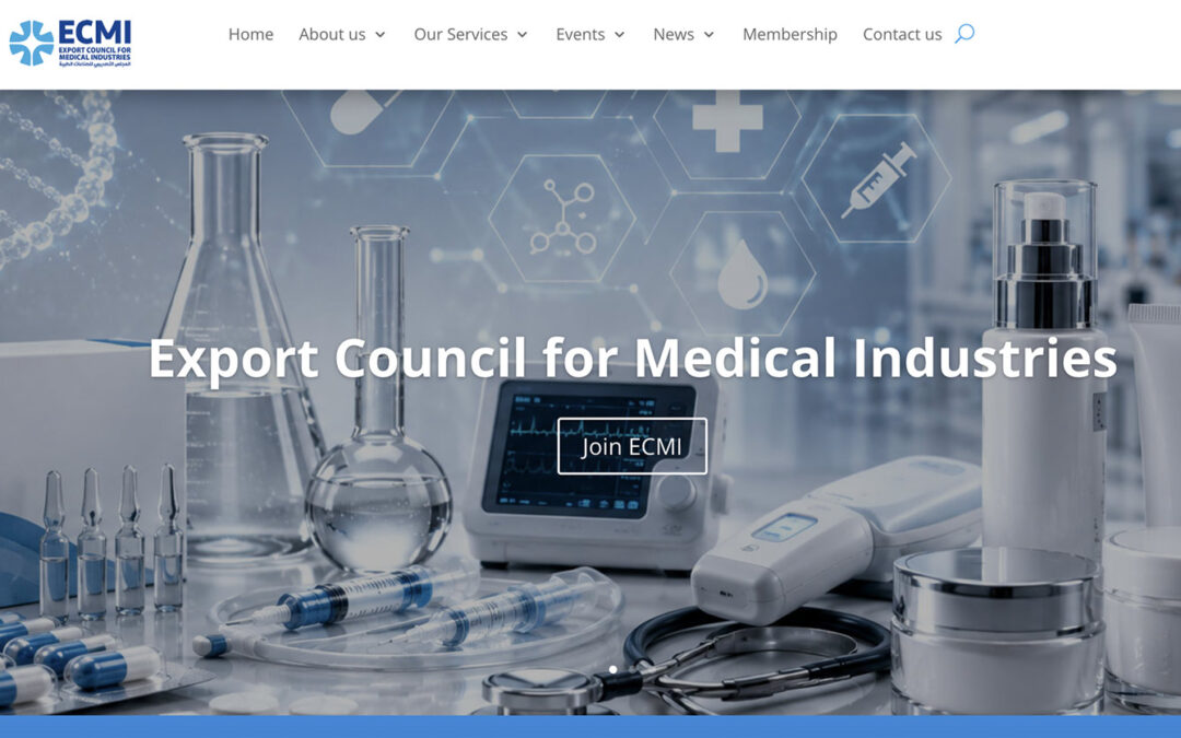
From Data Overload to Interactive Clarity:
The ECMI Digital Transformation
When an institution possesses decades of valuable data, research, and industry insights, its biggest digital challenge is rarely a lack of content—it’s information delivery.
Without a clear visual hierarchy and intuitive user experience (UX), a massive database can easily overwhelm visitors. When tasked with designing and developing the digital presence for ECMI (Egyptian Center for Media Studies and Information), the core challenge was ambitious: Take a vast ecosystem of complex data and transform it into a modern, animated, and highly engaging web platform that users love to explore.
The Problem: The Cognitive Load of Big Data
ECMI needed a digital hub capable of serving researchers, industry professionals, and institutional partners. However, the existing data structure presented three major friction points:
Information Fatigue: Browsing through dense reports and static text blocks created a high drop-off rate among visitors.
Outdated User Experience: The platform lacked dynamic elements, making essential insights feel hidden rather than accessible.
Complex Customer Journeys: Diverse user personas needed different data sets quickly, but navigating the site felt like searching for a needle in a haystack.
To build a platform fit for modern digital standards, we couldn't just store information; we had to visualize it.
The Strategy: Dynamic Infographics & Animated Visual Architecture
We approached the project as both digital architects and visual storytellers, establishing a design philosophy where every data point tells a story.
[Massive Raw Data Sets]
          ↓
 [Infographic Decomposition & Micro-Animations]
          ↓
   [Frictionless Discovery & High-Engagement UI]
Key Execution Pillars:
-
1. Animated Infographic Modules: Instead of static tables, we engineered custom interactive infographics. Key metrics, statistics, and industry milestones come to life as users scroll, making complex media research instantly digestible.
-
2. Modular UX/UI Design: Using modern layout grids, we organized vast categories into expandable cards, visual timelines, and clean data dashboards. This allowed users to dive deep into reports without cluttering the screen.
-
3. Performance Optimization for Motion: Micro-animations and dynamic transitions were built with lightweight code frameworks to ensure smooth, lightning-fast load times on mobile and desktop devices across the GCC and MENA regions.